“Simple” is Always in Style
You’ll never have to apologize for “simple and tasteful” landscape designs. They’re great starting points, and many of us choose never to move much beyond that clean, basic look.
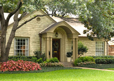
Start with the focal point. What is the most critical thing that you want people to see when they look at the front side of your home? In almost all cases, it’s going to be your front door. Everything you plant should send viewers’ eyes right toward the door.
Frame the look by using taller plants to the sides to create a visual funnel. What you want is a fairly clean, simple V-shaped taper of taller plants to the left and right sides of your house, down to the front door. Create an exclamation point near the door with a small, tree-form holly or crape myrtle – something planted 10 or 12 feet out from the door just to draw attention to the entryway garden.
Choose plants whose mature sizes fit your needs. If you’re seeking a plant that will fit into that visual funnel at 5 or 6 feet in height or width, choose one that grows to that size at maturity. Don’t buy larger species and resort to constant pruning to keep them in bounds.
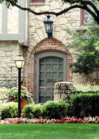
Plant in gentle, sweeping curves. Corners take extra time for mowing and trimming, and they tend to draw undue attention to their parts of the garden design. One long, graceful curve across the entire front of your house can look very good.
Let that elongated curve wrap out and around the corners, 8 to 15 feet away from the house (to allow room for the taller plants to the sides), coming in to 6 or 7 feet of width against the walls, and then out from the entryway to allow space for the accent plant and any decorative garden art you might want near the door (large pots, sundial, etc.).
Let the outer line of your front bed continue across the walk in a smooth contour (even though it may be farther out from the house on one side than the other)
Use a pleasing variety of textures and growth forms, but be careful in using highly variegated plants. They can be eye-catching, but don’t overdo it. They can quickly become very distracting.
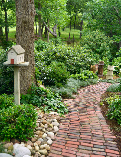
Groundcovers, river rock and bark mulch give a look of continuity to bare soil in their parts of their gardens. They act as the unifying entity, much as carpet or hardwood flooring will do for the inside of your house. Use them wisely, and keep them tidy.
Color beds can be small and strategic. They may flank either side of your entryway garden, or they may be along part of the walk. They may even spill out across the front of your house. Or, they may consist of nothing more than five or ten mid-sized and large decorative pots filled with interesting plants.
And for the backyard…
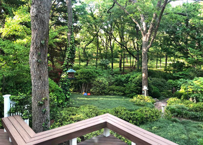
The same principles apply when you’re designing the landscape for your backyard, except you flip things inside-out. The prime views won’t be of the back side of your house. They’ll be from inside the house looking out. That means that your focal point will be out in the landscape somewhere, and all that you do needs to draw attention to it.
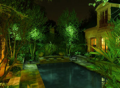
If you have a lovely garden pool, your landscape should attend and surround it. If you have only turfgrass, your focal point may be a fountain, statue or lamp toward the back of your yard. Taller plants will be off to the sides (except as needed for privacy), tapering down to showcase the focal point, whatever it is.
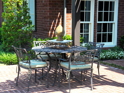
Otherwise, all the same principles apply in the backyard. Start simple, and venture forth carefully. You’ll see some lovely results.
