Short Steps to Fine Landscapes
Your house is the biggest piece of artwork you’re ever going to own. It’s your magnificent painting, and so the frame you use to enclose it needs to be equally fine. It needs to showcase your home’s beauty and conceal its blemishes.
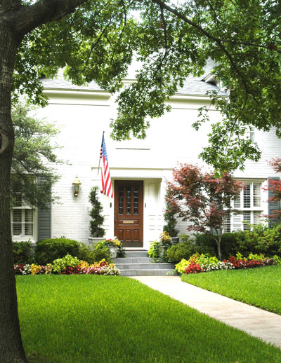
Most of all, your landscape shouldn’t draw undue attention away from your house, specifically its prime focal point, the front door.
To emphasize the focal point of your landscape design…
Here are a few suggestions I’d make to help you direct viewers’ eyes right where you want them.

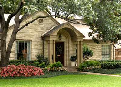
• Widen the beds. It’s that “scale” thing. Too many people plant in 3-foot-wide beds when they’re landscaping a two-story house. Beds might be more appropriately sized at 5 to 7 feet wide, broadening out to 12 or 15 feet as they go around corners or cross over the front walk. One-story homes might call for 4-foot beds that widen to 7 or 8 feet at the corners.

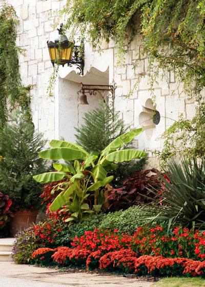
• Put in some curves. You want your landscape to look like the house just appeared in a lovely meadow, and meadows rarely have straight rows of plants. Use a flexible garden hose on a warm fall day to lay out the beds in elongated, sweeping curves. Avoid straight lines that (uncomfortably) mirror the man-made lines of the house.
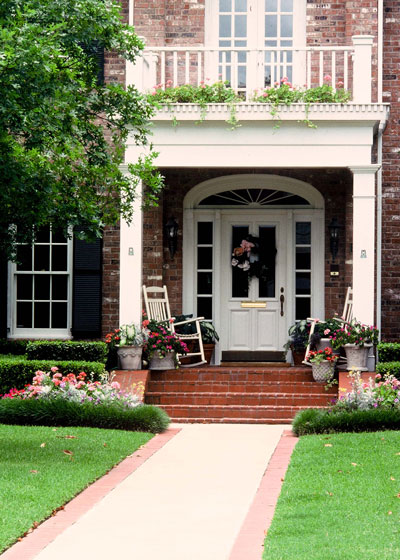
• Forget about symmetry. Your house isn’t symmetrical, so you don’t want to have the same kinds of plants trimmed the same kinds of ways on both sides of your front door. It never looks comfortable. Use natural clusters and groups of plants that look good together.

• Let your plants grow naturally. Avoid square or round shrubs. Square shrubs repeat the lines of the house and they draw attention away from the front door. Your eye is taken to the unnatural look of plants that are pruned into the shapes of boxes and balls. Choose plants that grow to the mature sizes you need, then prune only to correct erratic shoots.
• Maybe no rings around tree trunks. This is a personal opinion. I admit that. And I also admit that there are hundreds of beautiful landscapes that have tree rings. But it just seems to me that a tree’s trunk isn’t its most beautiful feature, and putting it in the center of a bull’s eye merely draws more attention to it. Encircling the trunk with flowers just adds more drama. If you want to have a bed beneath your tree, enlarge it and make it something other than perfectly round. And let the tree be somewhere other than right in the middle. It will look more natural.
• Perhaps don’t line both sides of the walk. If you have a winding walk, planting groupings of shrubs and groundcovers might help give direction, but if you have a walk that goes straight from the door to the street, planting a row of shrubs or tall groundcover plants on both sides turns that walk into a zipper. It cuts the landscape into two pieces and makes the walk the big scene-stealer. It’s better not to draw attention to the walk. Just let it exist.

Again…
This has all been just one guy’s opinions. There is no one perfect way to develop a landscape. I just hope some part of this was useful to you.
