Color gone wild
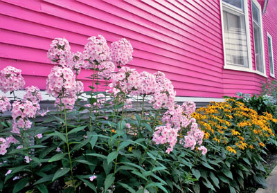
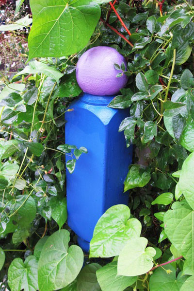
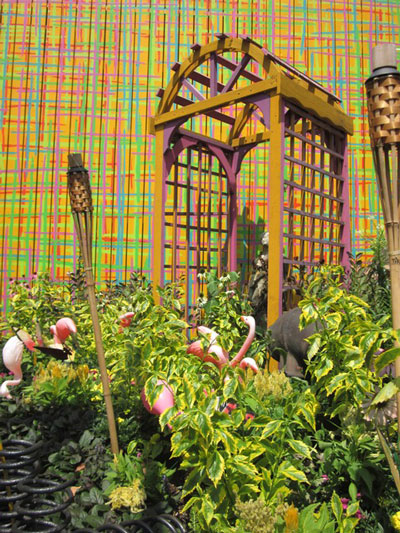
Yellow flowers against a bright pink wall, a purple and orange fence, maroon foliage atop a yellow Styrofoam head: when it comes to bold garden color, it’s fun to follow your passion. But even when you toss “color theory in landscape design” out the window, there are a few color basics to consider before picking up a paint brush or buying flowers in every hue.
Remember, colors do not stand alone in landscapes. They interact with the colors of nearby structures, they affect depth perception, they direct attention, and they interrelate with sunlight and season. Colors also influence mood.
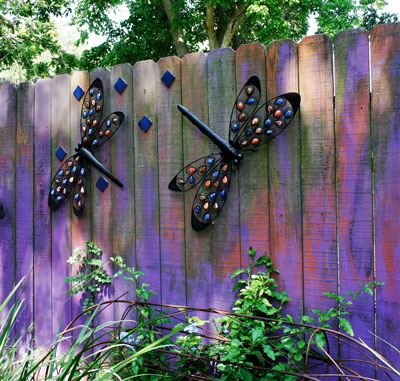
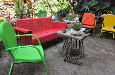
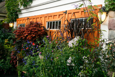
Cool colors– the blues, purples and greens—tend to be tranquil, dreamy, and calming. They bring to mind water, mist, and meadows. They are the perfect hues for a meditation garden. Warm colors—the reds, yellows and oranges—are party animals. They invigorate, energize, and excite. Think summer sunsets and guest-filled patios.
Color “temperature” also affects depth perception. Like shy wallflowers, cool colors seem to recede, making them appear to be farther away. Magically, gardens seem larger. Warm colors have the opposite effect; they appear to come forward, making the space seem smaller.
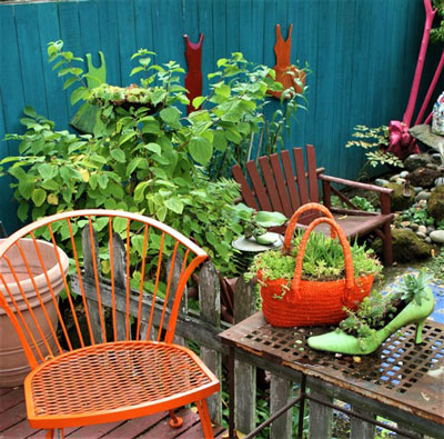
Warm colors also have an uncanny knack for attracting attention. Use red, yellow or orange to draw visitors into a space, to create a focal point, or to direct views away from an area. Its exceptionally high intensity and over-the-top capacity to contrast with nearly all other colors makes bright yellow an expert scene stealer.
Remember, too, that color reacts to light, and light changes hour by hour, season to season. On one hand, summer’s blazing sun makes colors appear richer and more intense; on the other hand, the glare created by noon sun can visually bleach even the most highly saturated hue. Generally, colors appear more subdued in winter’s filtered light than under summer’s intense rays.

But light isn’t the only color “influencer” that changes with the seasons. By their very nature, plants emerge, thrive, bloom, and spread. Leaves unfurl, change color, and fall. Some plants die back in winter, only to reemerge with new energy and vibrant colors the following spring.
Hardscape color is easier to manage, but before you paint the fence purple remember that although it will provide a backdrop for flowering vines and lush perennials in summer, it might stand front and foremost by the time winter rolls around.
Color wheel…what color wheel?
All things said, color preference is personal. Specific colors can trigger memories of a summer at the beach, your child’s first birthday, a favorite painting. So go ahead, let passion reign. After all, beauty is in the eye of the beholder.