Fine-tuning the focus
Last week we discussed the importance of focusing attention to your front door when you’re doing your landscape. It’s the visual funnel that guides people’s eyes right where you want them.
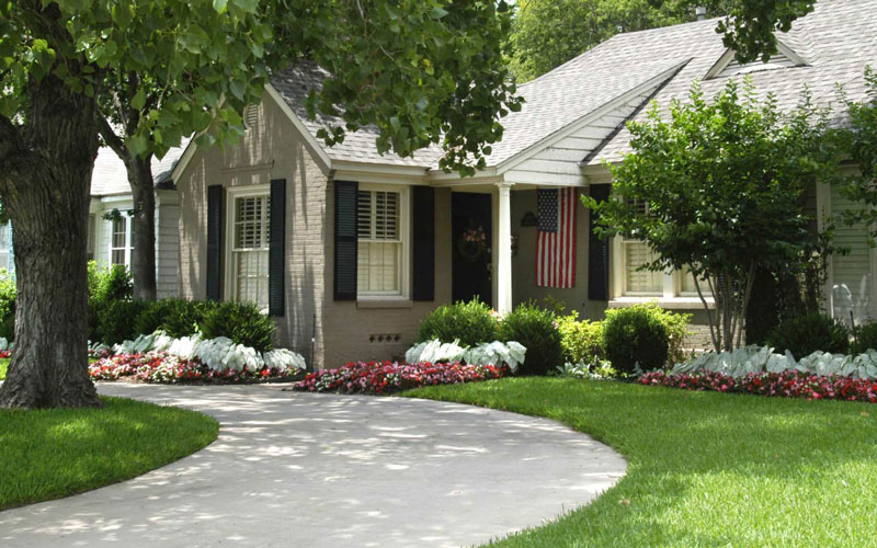
We also stressed the importance of scale – that you want your front beds to be sized proportionately to the house itself.
I’m going to pick it up at that point. Here are a few more ways I see people heading for the ditches when they’re doing their landscapes. Mind you, design is a personal thing. These are just my opinions, and it’s not my goal to offend any reader. But if you’re setting out to do (or re-do) a landscape, maybe these thoughts will be of help.
• Don’t try to insert symmetry where none exists. Most houses are not mirror images from one side to the other, and for that reason it’s usually better not to use a mirrored landscape plan. Even if it were to be completed perfectly and maintained without flaw, your design might still look restless to your eye, and you might not be able to determine why.


• Along a similar line, avoid square or round shrubs. They’re extra work, and they draw attention to themselves, not to the house. Choose plants that grow to the height and width you need, then let them grow naturally. Oh, sure you can trim them and guide them, but always do so with an eye toward maintaining their natural form.
• Bold, conspicuous edging. I’m always amazed that people buy edging, then install it in a way where it shows. They either use green metal edging and leave most of it up above grade, or they use heavy stone or timber edging that takes visual command of its part of the garden. At least in my playbook, you’re using edging as a means of defining your beds, not as an architectural statement in your gardens.

• Rings around shade trees. Trunks are not the most beautiful parts of our shade trees. Why would we want to highlight them? Why would we want to showcase them with metal rings or circles of stone? Why would we feel compelled to plant flowers against them? All that does is draw attention away from the entryway and out into the landscape. Better design would be to let grass grow up to the trunk and keep it neatly maintained. When shade eventually causes the grass to fail, then you would develop groundcover beds with irregularly sweeping curves. The tree wouldn’t be in the center of the bed.
• Row-plantings along the front walk. If your walk goes from the street to your door, there’s no need to emphasize the sidewalk. Again, it’s not the focal point of your garden, and there’s no need to create a visual “zipper” that splits your landscape into two halves.
