Focus on the Right Things
Think of your house as a painting. Your goal as you showcase your artwork to all who pass by will be to show it off to best effect. Your landscape is where that all starts. Let me give you some pointers in a two-part story that will help you get maximum impact for minimum effort and frustration.
Think of your landscape as a picture frame for your piece of artwork (your house). Your function is to complement the artwork, not draw undue attention from it. You wouldn’t choose pink polka dots for your Monet’s frame. You would look for something tasteful and simple, probably elegant and perhaps natural. And, that frame would be in scale with the size of the artwork.
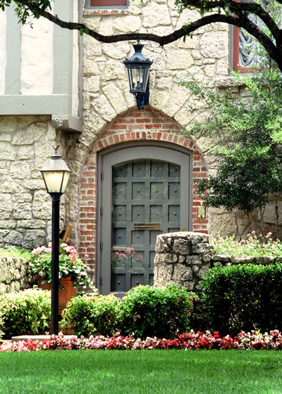
This week and next I’m going to share ways I see gardeners getting too “cute” with their landscaping – ways they take its true purpose off course.
Let’s start with bed design and layout…
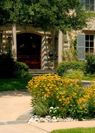
• We forget the focal point. The place you want to draw viewers’ eyes will be to your front door. It is to your house what Mona Lisa’s eyes are to her beauty. Never forget it as you design.
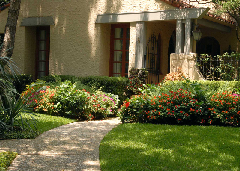
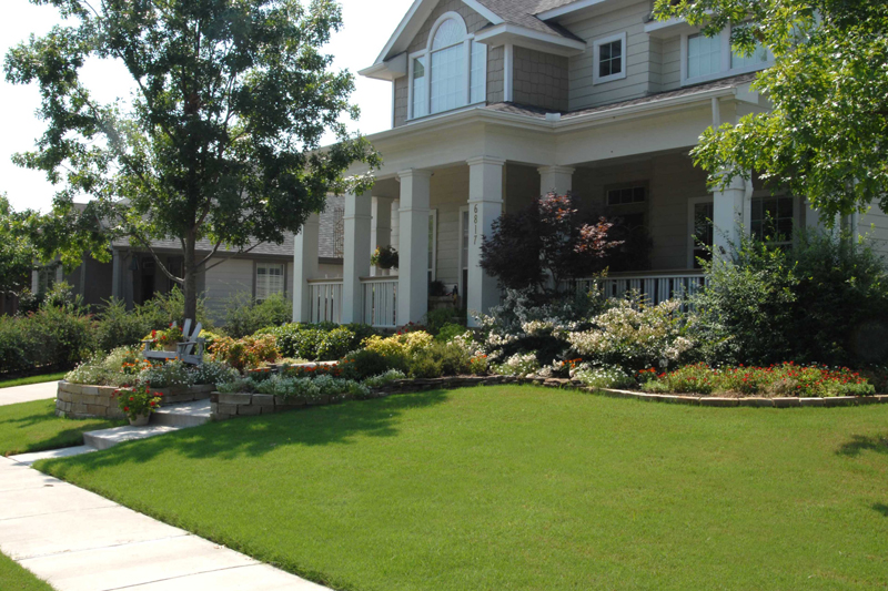
• Narrow beds. This is that “scale” thing. If your house is two-story, and if your property is reasonably large, the beds you design need to be appropriately sized. That might mean that they’re a minimum of 5 to 7 ft. wide, and they might even roll out to 12 or 15 ft. around corners and at the entry.
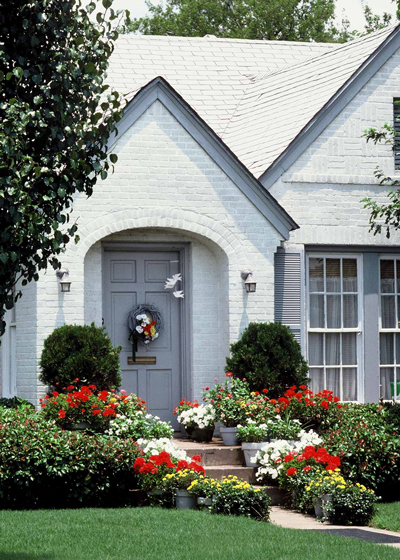
On the other hand, if you’re landscaping a one-story home on a small urban property, bed widths need to be scaled back to 3 or 4 ft. wide, broadening to 6 or 7 ft. at corners. This whole scale and proportion thing can be compared back to the picture frames. If you’re framing a large painting that will hang behind the sofa, you’ll use a wider frame than you would for an 8×10-inch hallway photo of the family.
• Straight beds. These points build on one another, and we’ve already alluded to the fact that your beds might have varying widths, wider at the entry and corners, and narrowing in-between.
Your goal in landscaping is to create a pleasant natural “meadow” into which your house magically appears. Nature works in curves, almost never in straight lines. Long, gentle and sweeping curves will be more appealing visually. Straight beds merely repeat the lines of the house. Unless you’re creating a highly stylized formal garden, it’s better to avoid the straight lines.
